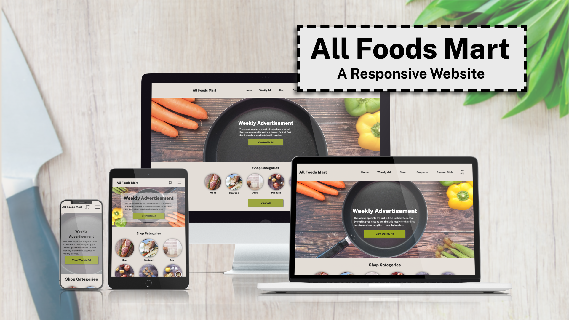

All Foods Mart: A Responsive Website
This project was built by me, to be used as an example for students who don’t understand how to include the information required in their project presentations, and to demonstrate how you can use your design to illustrate your process on a project.
- The Project
- Given content, wireframes, and brand colors/fonts, students in GIT414 were asked to code a responsive, single-page website that would display properly from 320px wide and up while being accessible, user-friendly, and having appropriate meta tags to improve SEO.
- Demonstrate that you understand how to follow best practices in the web development process from goals, to design, to development, to testing, and finally to deployment
- The Client
- The client for this project is a grocery store called All Foods Mart. Beyond the content given, there were no additional details about the store. It made the most sense to me that this would be a local store or chain that appeals to their customers by offering low prices and coupons, in addition to quality foods grown or raised locally.
- The Audience
- Because this is a smaller, local store, the audience would be those who are local to the area. Unless they truly focus on hard to find and specialty foods, most grocery stores do not pack and ship foods, but instead focus on offering the items that their local customers are looking for. The audience would likely include a mix of men and women, probably with at least slightly more women than men in general visiting the store or website. These clients would be looking for affordable groceries that are also fresh and high quality.
- The Assets
- Headings: Public Sans Extra Black
- Body Text: Public Sans Medium
- Icons: Tabler
- Colors:
- Blueberry: #1F4373
- Veg: #96A61F
- Cranberry: #A64037
- Toast: #73532D
- Grain: #BF9004
- Additional Text & Background Colors:
- #eaeaea
- #222222
- #ffffff
- Wireframes
- Wireframes for the site were provided (designed by Christina Carrasquilla). The largest screens adjusted the layout to take advantage of the available area, while the smallest ensured that all of the same content would be displayed at all widths and in all browsers.
- Content cannot be removed from smaller screens – all of the same content (with a similar brand and user experience) will display at all widths.
- The Design
- My first step when determining which colors to use on the site for each purpose (CTA, navigation, background and text colors), is to check the contrast for each pair.
- After determining which colors offered the best contrast, I used the colors in different combinations for each purpose.
- The calls to action on the page use the green veg color, with dark gray for text and icons. Focus styles use the cranberry red color to draw attention. Because the colors were bright overall, I toned the toast color down a bit with transparency to use as the background for the page. Subtle shadows were used to give the page some dimension. Text is large and easy to both scan and read.
- Contrast of #222 Text on #eaeaea Background:
- 11.77
- Contrast of White Text on Cranberry Background:
- 6.15
- Contrast of #222 Text on Veg Background:
- 5.88
- Contrast of White Text on Blueberry Background:
- 9.55
- Contrast of White Text on Toast Background:
- 6.99
- HTML Requirements
- Semantic
- Accessible
- Valid
- Attention paid to SEO best practices
- Avoid using divs unless they’re absolutely needed for styling
- HTML Process
- I focused on using semantic elements on the page, but before adding the content I ensured that I had added appropriate meta tags for display and SEO, as well as a link that would allow users to skip to the main content with their keyboards once styled.
- Content was grouped logically, and in the order in which it appears on the page. Divs were not added until the styling phase of the project, and were only added to limit content width inside of containers with a background color that would be the full screen width.
- HTML was validated before moving on to CSS.
- CSS Requirements
- Accessible:
- Good contrast
- Appropriately sized click targets
- Content styled in the order it appears in the HTML
- Don’t remove focus styles
- Accessible content hidden correctly
- Appropriate font sizes
- Usable:
- Easy to scan
- CTAs are styled to draw attention
- Accessible:
- CSS Process
- I chose to use Normalize in this project, so I first made sure to link to that file before linking to my custom stylesheet.
- The site was coded mobile-first, and I began by adding the CSS variables I would need for colors, shadows, and fonts. I then added some global styles that I knew I would need (setting links and images to block display, adding some basic padding and text sizes for headings), then began to add the custom styles for each section.
- The site was tested during the development process, and styles were adjusted as needed until the content displayed appropriately at all widths from 320px and up.
- Testing Performed
- Visual testing
- Elements appear as expected
- Keyboard testing
- Can the site be navigated with only a keyboard?
- Does the tab order make sense?
- Are focusable elements visually styled on focus?
- Lighthouse testing
- Accessibility
- Usability
- Best practices
- SEO
- Visual testing
- Testing Process
- I tested throughout development, mobile-first. Google Chrome was used as the main browser for my development, and I also tested in Firefox and Safari once things looked good in Chrome.
- Adjustments were made as needed, followed by more local testing in browsers to ensure consistency. I also tested for keyboard navigation throughout
- Once styles were consistent, I uploaded files to the ASU Webspace, then began testing on other devices and in different browsers. I also used Chrome’s Lighthouse tool to catch some missing image size attributes.
- Lighthouse Scores:
- Performance: 100
- Accessibility: 100
- Best Practices: 92
- SEO: 100
- Deployment
- Before deploying the site to the ASU webspace I completed thorough local testing. Further testing was done after the site was uploaded and edits were made as needed.
- After completing further testing and updates to the code to improve page load times, the site was uploaded to GitHub and published to GitHub Pages.
- Reflection
- While I am happy with the way the site turned out, if given more time there are definitely things that I would change or improve if given more time.
- Adding some micro-interactions could do a lot to improve the page, as well as adding a back to top button for small screens.
- While the hero image is changed based on screen width in order to show the more decorative parts of the image and ensure that the overlaid text is still readable, more could be done to improve the display in that section overall.
- While I am happy with the way the site turned out, if given more time there are definitely things that I would change or improve if given more time.
Please follow and like: